2023 Trend Colours: What’s Your Take?

Let’s take a closer look at the colour trends and forecasts for 2023. And, I’m sharing my thoughts along with how you might incorporate them into your home.
THIS is the time of year when excitement ripples through the design community. You know, when the paint companies reveal their colour palettes trends. Do this year’s predictions jive with your expectations? Which are hits? Which misses?
I’m going to share my take with you. Please post yours in the comments below!
What’s the use of colour predictions?
AND, every year when this topic comes up, I need to state the disclaimer: no one is saying these trends are some kind of rule you need to follow to be “current”.
It’s also not a conspiratorial marketing ploy to get you to buy all new things and repaint your house every year. Marketing is a big part of it and the trend colours will influence colour for products coming to stores near you. But it’s important to remember that the forecasters’ crystal balls are largely informed by YOUR collective colour choices. That’s right, you help decide – see it explained in this video.
Trend predictions are always offerings you can take or leave.
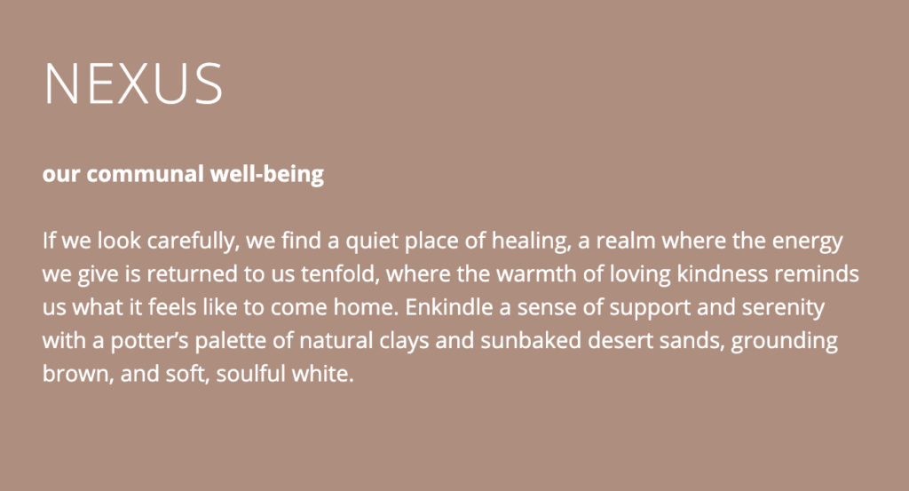
There are all kinds of lofty, abstract cultural theories about why this colour or that is trending. Like this one below from the Sherwin Williams Nexus trend palette for 2023.
Personally, I think it’s simpler than that. Collectively, we get tired of something that has been overplayed and look to the charms of its opposite.
Grey on grey, to minimal neutral WHITE modern farmhouse, to stark black and white is where we’ve been for almost two decades now. Which means almost unanimously, COLOUR is in the forecast.
A solo colour of the year is not very telling. But, what I like about the paint companies’ approach is they generally release whole palettes. And while there is way too much to cover, here are some of my overall impressions.
There appears to be two colourful directions being proposed. Earthy and warm: terracottas, earthy reds, natural greens, warm beiges, taupes and browns. And a much more saturated punchy range of colours that include jeweled reds, pinks and teal.
A warm red colour story
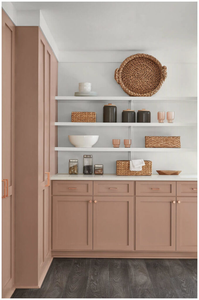
Sherwin-Williams’ colour of the year for 2023 belongs to their Nexus palette, which is an all-in-embrace of earth tones. These desert rose, mauve, terracotta and beige tones have had a long run in fashion. And now it looks like Sherwin-Williams predicts they will be more popular than some of the more saturated colours being promoted by other brands this year.
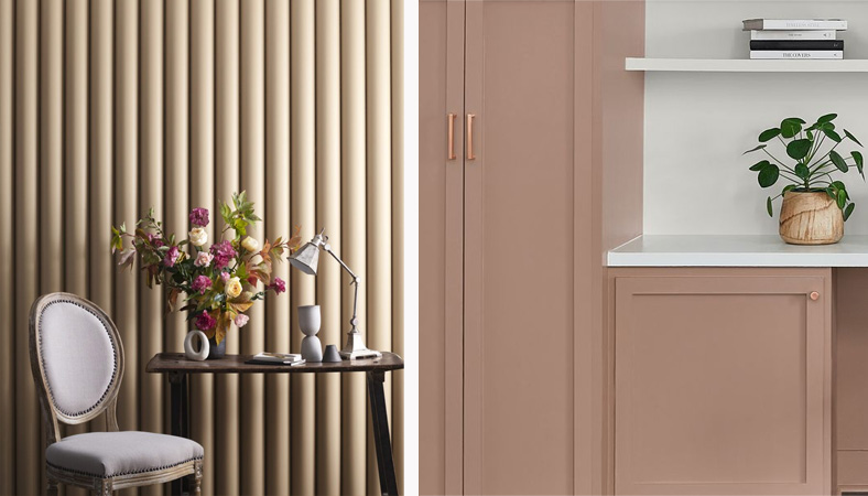
Sherwin Williams COTY 2o23 Redend Point
While this range of mostly pink-based tones is not for everyone, they are very useful for warming up an overdose of charcoal, grey, black and white, as it does nicely for the floors in the image above.
When SW launched Redend Point as THE colour of the year (COTY), the buzz on all my feeds was that it is the dreaded pink beige. First, there is nothing wrong with pink beige in the right context. But most importantly, while this colour certainly is very muddy with a red undertone, it is not a beige in my system.
Here it is below compared to a system deep pink beige, BM Bradstreet Beige HC-48.
SW COTY Redend Point (right) compared to a Killam Colour System Pink Beige (left) – learn more here
If this 2023 SW earthy palette appeals to you, keep in mind that an abundance of crisp off white or cream is the easiest way to keep it looking fresh and current.
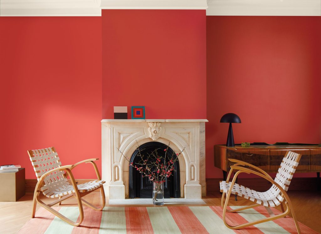
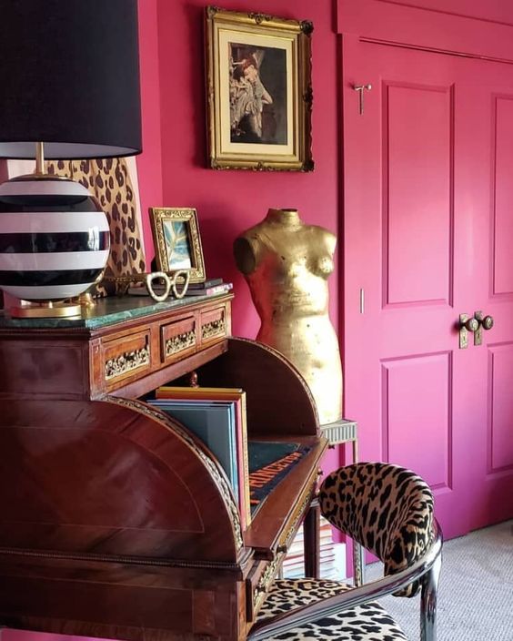
Benjamin Moore took the bolder approach, predicting a move towards much more saturated colour. Their feature colour is also red-based, a much more saturated raspberry coral. Not unlike the colour I love in my powder room.
This is a seriously happy colour (obviously, I tend to prefer more saturated colour as you can see in both recent versions of my living room here and here).
Benjamin Moore COTY 2023 Raspberry Blush
It doesn’t get much warmer than red-based colours and there is a range of them in this year’s trend palettes (see what I mean about swinging to opposites?). They range from a cinnamon burnt red, to coral, and mauve. Dunn Edwards also picked an earthy deep pink, Terra Rosa. Overall these colours are much more intense and committed than the blush pinks that have been around to sweeten grey for a long time now.
Pantone is also calling it in the red range with Viva Magenta. Since Pantone is not coming up with liveable paint colours, this is a much more saturated colour. But if you like drama, it is a dramatic accent to use in a room. It’s a pink that leans into violet (blue) and it’s one of the primary colours of the subtractive CMYK colour system (often using in printing, along with Cyan, Yellow and Black).
Palest lavenders, deepest plum browns
Magenta can lean quite purple and violet is a subtle but consistent presence in the trend palettes this year.
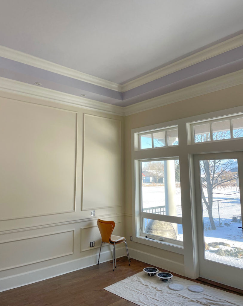
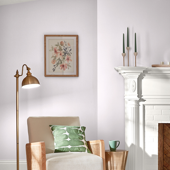
There are pale lavenders (BM New Age, SW Wallflower), which I’m all for. Of course I’m doing lavender again, this time in our new primary suite tray ceiling (see above)!
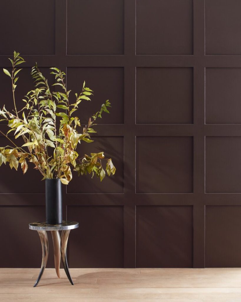
Wrapping walls in a deep moody tone is still going strong and the deep tones are moving away from achromatic charcoals into warmer, brown-toned versions. These dark browns are mostly leaning violet as well.
Green is the colour of the decade
Recent year’s trend palettes have been heavy on GREEN. From emerald and leafgreen, to more grounded and muted greens like sage, olive and equestrian greens, it’s easy to see that greens have dominated the trends lately.
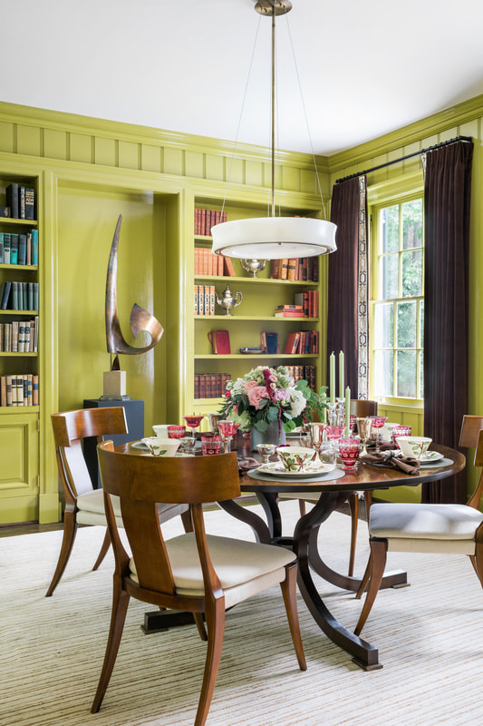
One green we haven’t seen as much of in the last decade though is expected to make a comeback in 2023. According to forecasters, greens are going citrine to avocado again. Are you ready for it? These yellow-based greens are bold, and certainly not for everyone.
But they make sense as accent colours in the context of some of the red, coral magenta and violet based colours in the palettes.
Hello yellow?
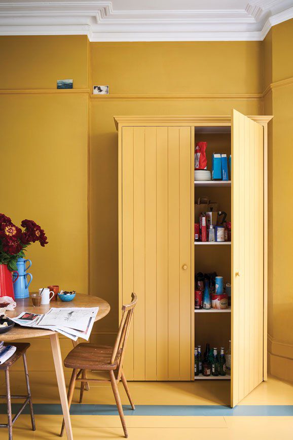
As you know, yellow is my fave. And while it’s not featured prominently in many palettes for the coming year, yellow certainly is both vibrant and warming and for those brave souls who embrace it, And yes, there is a range of yellows forecasted from buttery to warm orangey tones, leaning into earthy ochres (Behr Spiced Mustard) and citrine (SW Chartreuse).
Behr Spiced Mustard
Not completely off white (and not completely news)
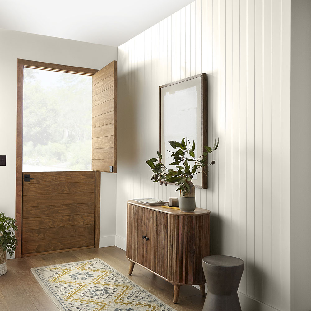
Behr is a bit behind the ball in my opinion with their off white with a hint of greige, Blank Canvas. Not because there is anything wrong with off white. It’s just that it is in no way NEWS. However people will walk into home depot and pick it up if they want a soft white wall, just the same.
So from a marketing standpoint maybe it’s a decent strategy. Hopefully, they at least test it to see if it relates to their finishes and decor, because white is not just white as we all know.
Behr COTY 2023 Blank Canvas DC-003
Bold teal colour predictions
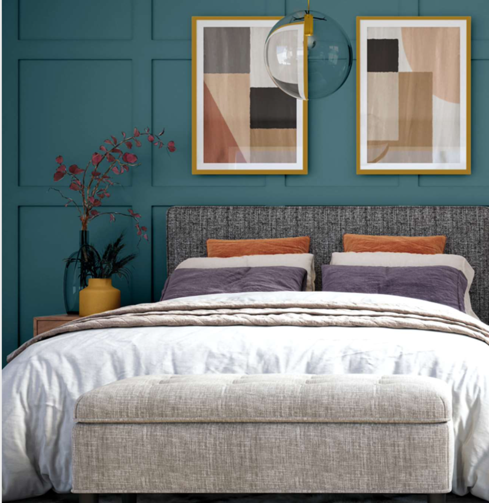
There are a consistent callouts for deep blue greens. Glidden called a deep teal, Vining Ivy, their COTY for 2023. Benjamin Moore and SW both have similar colours in their trend collections (BM Deep Sea Green and SW Blue Peacock).
I included a lot of beautiful blue greens in my Benjamin Moore VIP Collection and Sherwin-Williams Premier Collection of large painted colour boards.
My overall take on 2023 colour trends? It’s back to COLOUR!
It’s clear that there is consensus that rich, playful colour is what’s coming. An this is expected, considering that we went from grey-on-grey-on-grey to an OBSESSION with ALL white, and then WAY TOO MUCH black. As you know, my aesthetic is always full of colour, so I’m all for it.
So my advice is to have fun in 2023 experimenting with colour! I encourage you to relax and take a playful approach. And while it does take a bit more skill to pull off a stronger colour palette versus the neutral white-on-white with black and tan that we’ve been seeing, I’m here to help! With all this colour coming, there has never been a better time to sign up to get colour confident in one of my upcoming 2023 Specify Colour with Confidence workshops!
It will be interesting to see whether we completely move away from white and pale neutral walls. My prediction is we won’t since the average home is open concept with little opportunity to transition colour. That means white, complex cream, greige and beige will likely still be the dominant choices for main neutral wall colours.
If this is your situation but your heart is throbbing for bold colour, consider smaller enclosed rooms like your office, powder room, bedrooms, etc. And then create flow by sprinkling your bold new colours into your neutral areas in rugs, upholstery and decor for good flow (something I teach you how to do in my virtual SCWC courses!)
Happy decorating in 2023! I’m so grateful to be entering another brand new year with my favourite colourful community!
So what do you think of the 2023 colour predictions? Post your favourite hits and misses below. Will you be adopting any of these colours in your home?

